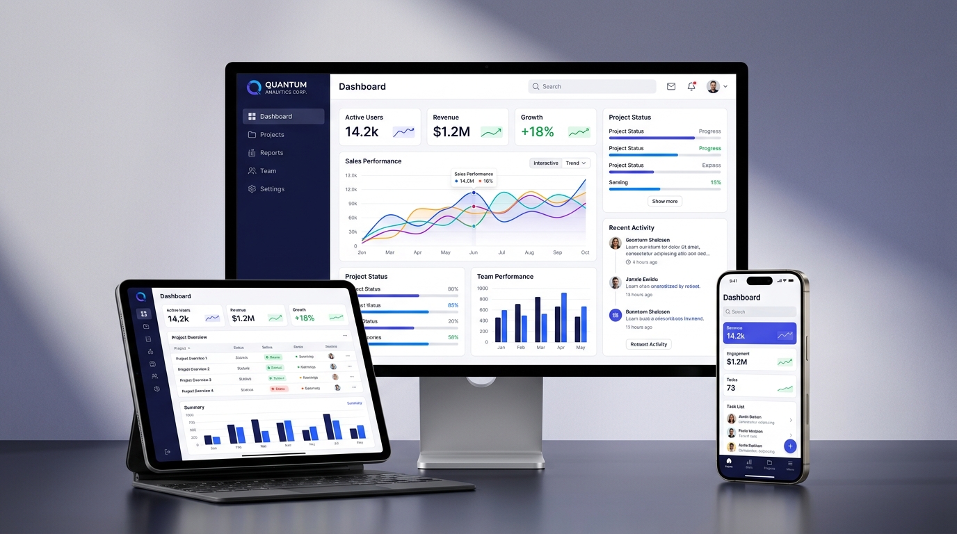
Creative Overview
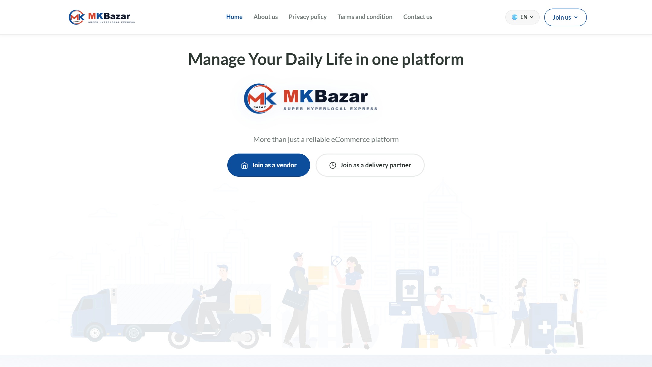
Modern users demand flawless experiences whether browsing on an ultra-wide 4K monitor, a business laptop, an iPad Pro tablet, or an iPhone. We design fluid, multi-device responsive web layouts in Figma with 100% vector scalability and auto-layout precision.
Multi-Viewport Specifications
- 4K Desktop & Laptop Viewports (1920px & 1440px): Spacious multi-column layouts with floating sidebars, sticky navigation, and expansive data visualizations.
- Tablet & iPad Viewports (1024px & 834px): Collapsible touch-friendly drawers, adaptive grid card restructuring, and landscape/portrait versatility.
- Smartphone Viewports (390px - iPhone & Android): Bottom navigation bars, touch swipe carousels, and thumb-friendly 48px tap targets.
- Figma Auto-Layout 5.0: Every frame is constructed with flexbox-equivalent constraints for 1:1 translation into Tailwind CSS, Bootstrap, or Vanilla CSS.
Demonstrated UX Impact
• 100% Cross-Device Consistency: Unified user journeys across smartphones, tablets, and desktop workstations.
• Zero Layout Shifts: Strict component sizing eliminates Cumulative Layout Shift (CLS) for optimal Core Web Vitals.
• Design Your Responsive Web App: Talk to our UX team at minfosoftware.com/contact.
Visual Deliverables
Product Interfaces & Modules
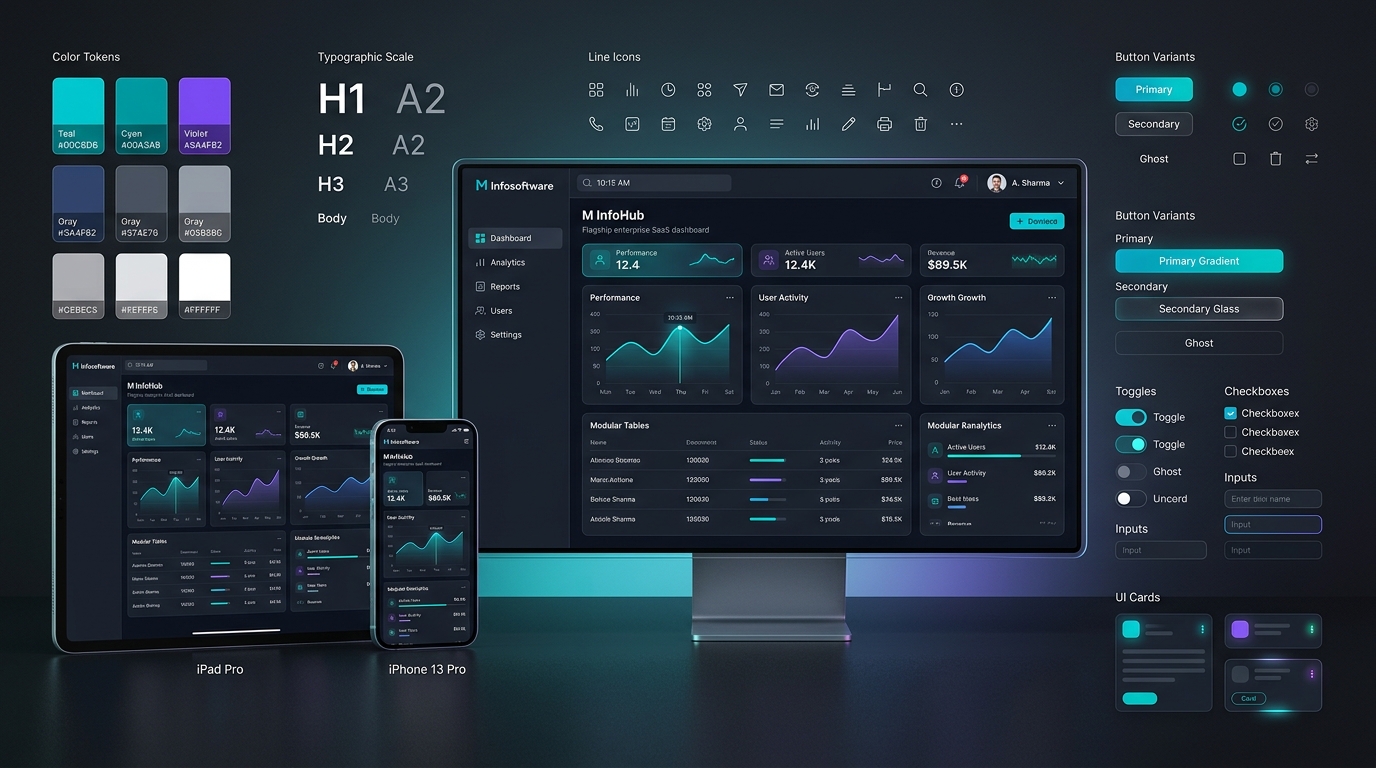
Enterprise Portfolio
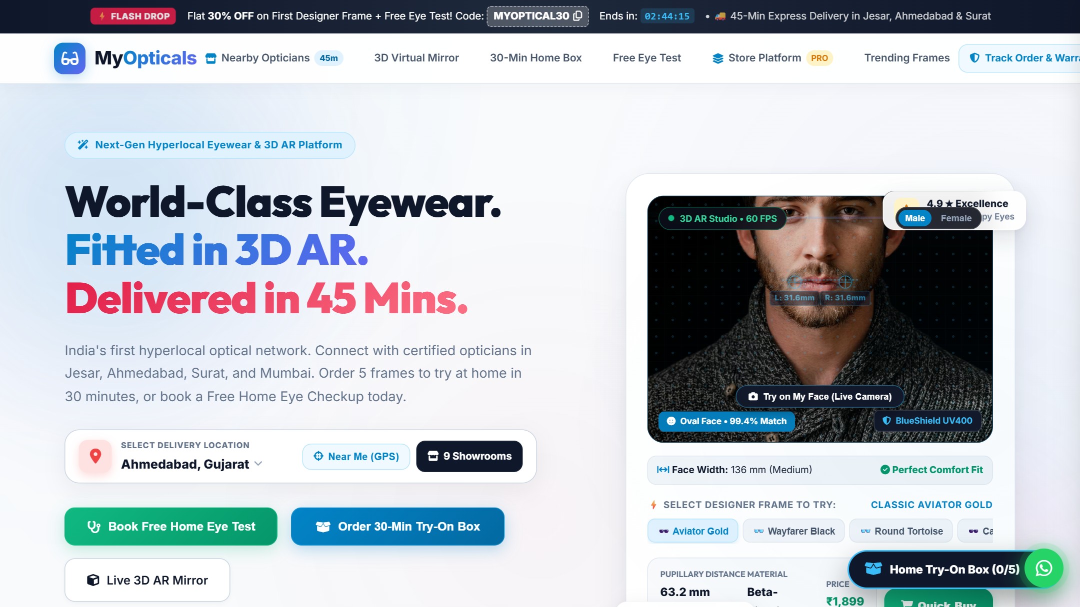
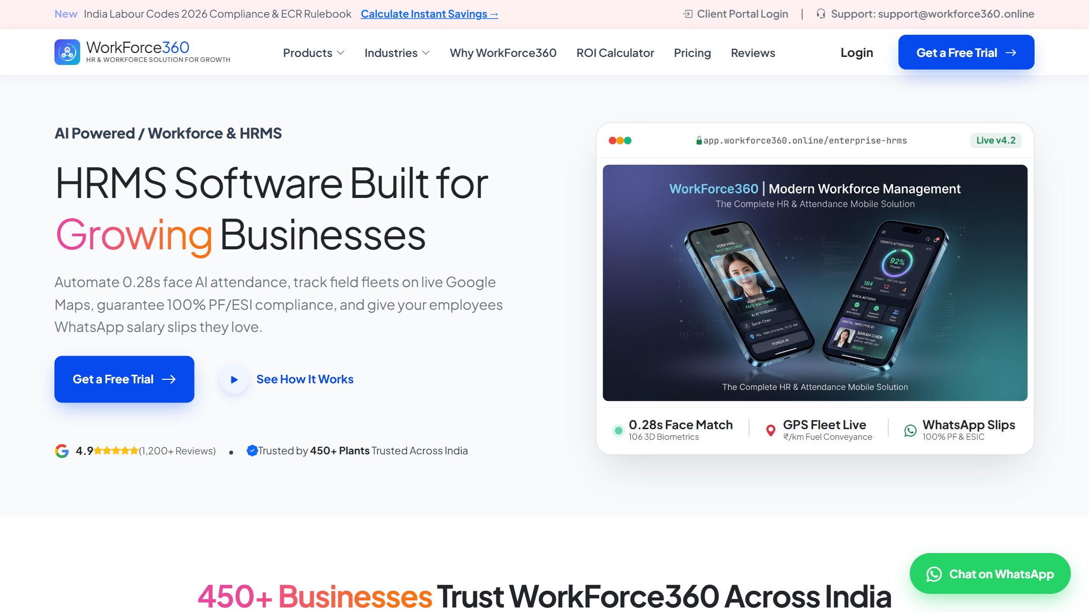
Explore More Featured Solutions
.png)